

02Wayfarer
Homepage Design
Wayfarer is a platform for seasoned travellers, offering a seamless way to discover travel destinations and explore travel blogs. Wayfarer integrates user-generated content and recommendations to enhance the travel planning process and inspires new adventures.
The Challenge
Design an engaging and intuitive homepage for a travel website that enables users to discover their dream destinations and access a range of travel packages.
Design Goals
Increase user engagement and conversions.
Showcase trips and destinations effectively.
Enhance brand awareness and user trust.
DIGITAL DESIGN / USER INTERFACE
Tools: Adobe Lightroom / Figma
Research
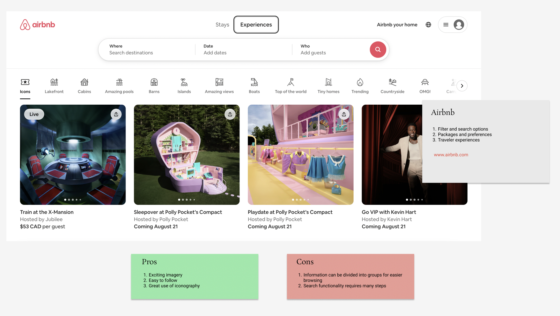
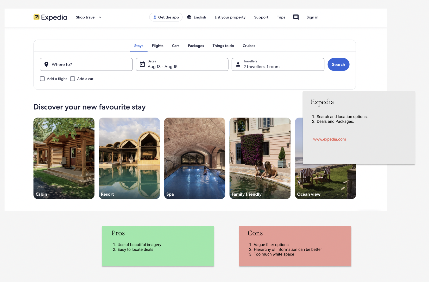
Keeping visual aesthetics and information architecture top of mind, I conducted a competitor analysis using three well known travel and booking sites. I thoroughly researched and surveyed travel bloggers and photographic journeys. I was able to derive valuable insights and also enhance my understanding and vision of the project.

Ensure that the most important elements like search bars and call-to-action buttons are prominently placed and easily accessible.
Design clear and compelling CTAs that guide users towards their goals, whether it’s booking a trip, exploring deals, or signing up for a newsletter.
Always ensure the landing page is fully optimized for different devices, including smartphones and tablets.
Implement a simple and intuitive navigation menu.
Insights derived through research
Mood board

I created a mood board to help me define the design language and help with the hierarchy of the website. I was able to lock down a colour palette and also understand how to frame the website better.
AIDA Model
Here is how I applied the AIDA model to design the landing page:
1. Attention: I wanted to use a clear headline and incorporate a eye-catching image that would resonate with the target audience.
2. Interest: The next section needed to engage the users through relevant content such as testimonials or stories.
3. Desire: The overall website needed to build trust and make the users desire what the company was offering through ratings and offers.
4. Action: Clear CTAs need to standout visually and includes action-oriented language.
Information Architecture
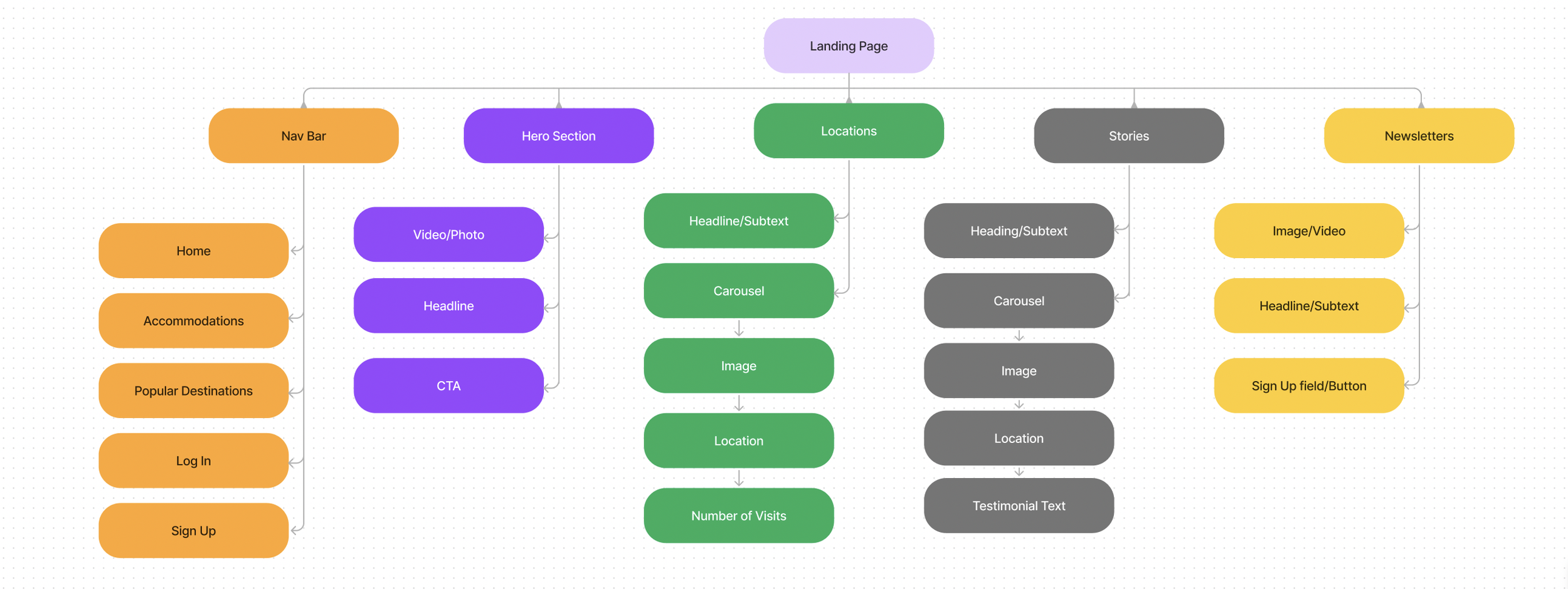
A well-structured information architecture enhances user navigation and improves the effectiveness of CTAs. Based on research, I streamlined the content into organized information blocks rather than scattering it across the page, making it easier for users to find what they need and engage with key actions.
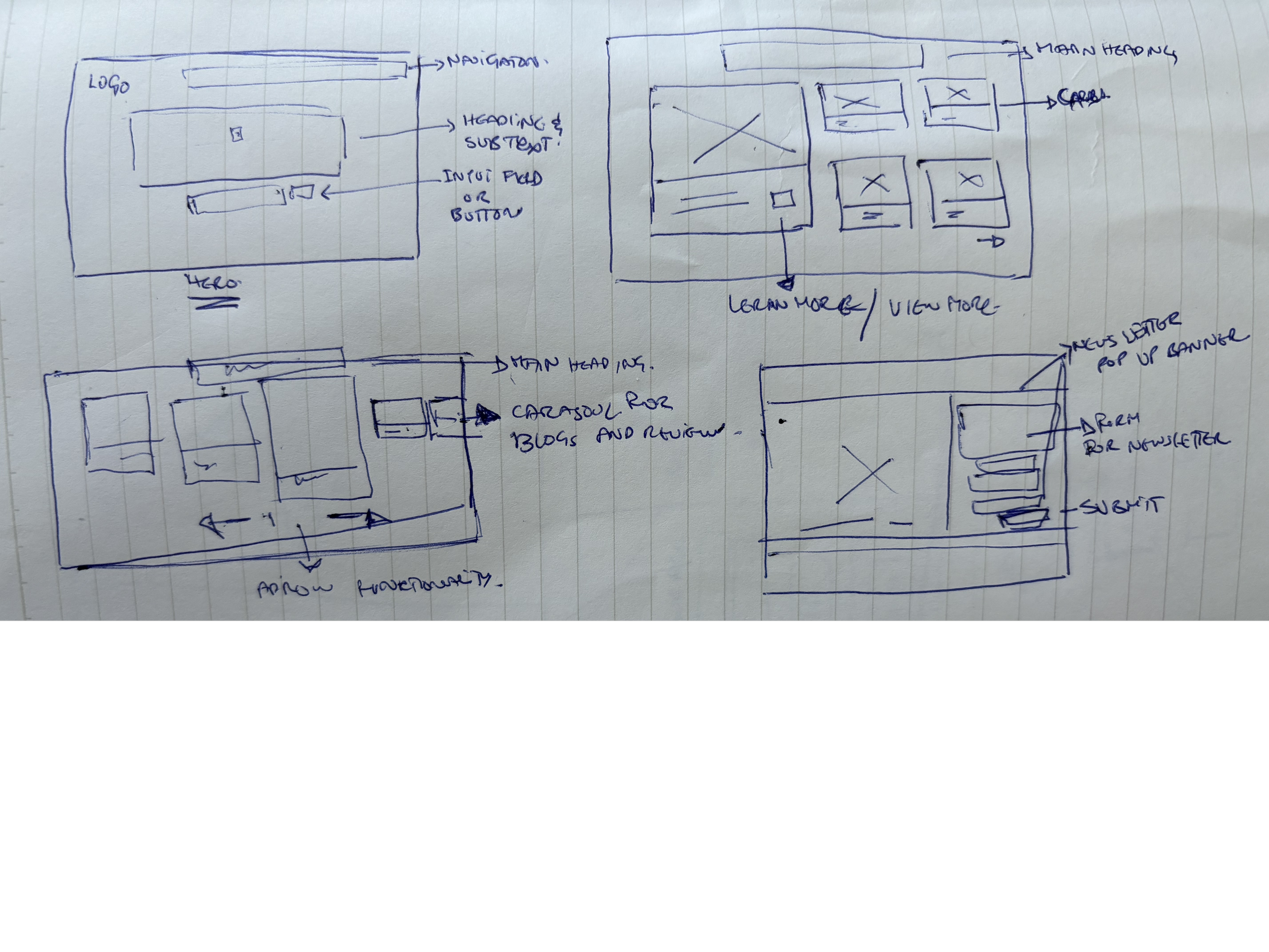
Wireframes
I began by sketching wireframes to outline the structure and flow of the page. My focus was on organizing information into distinct sections while strategically placing CTAs to guide user effectively through the page.
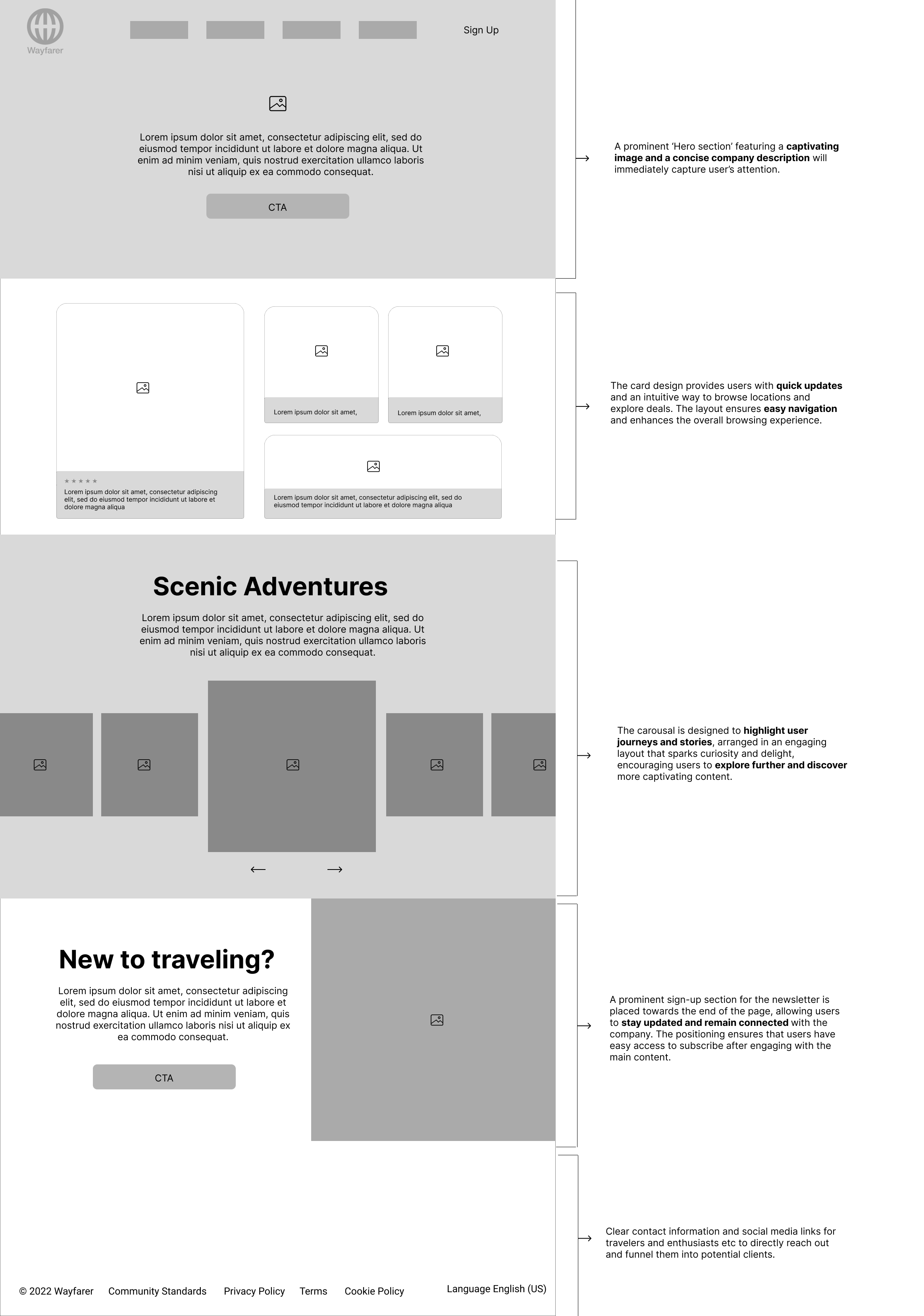
Prototype
The mid-fidelity prototype facilitates a smooth page flow, enabling users to effortlessly locate information. It guides users through each section through it’s well-structured hierarchy of information and creates interest as well as enhancing the overall navigation.
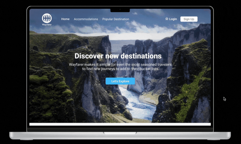
The ‘Hero section’ underwent multiple iterations with the primary goal to grasp users attention immediately and drive them to take action. Below, I have highlighted some key points that contributed to making this section both compelling and effective.
Hero Section
The headline was overly lengthy, detracting from the impact of the background image.
A sign-up button was added to the navigation bar to provide additional opportunities for users to stay connected.
The CTA button was made more prominent and designed to align with the overall design language, ensuring consistency and encouraging user interaction.

Location Section
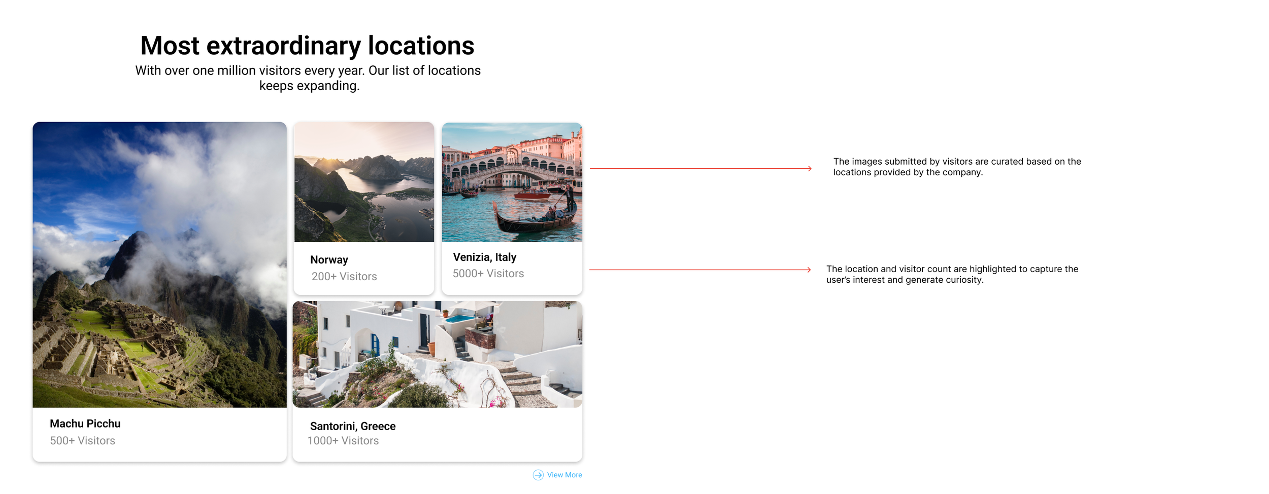
The cards appeared scattered, with an imbalance between the image and text ratios.
The cards were also text-heavy, which made them less visually engaging. To improve user interaction, the design needed to be more visually compelling and better balanced.
The "Exploring Locations and Destinations" section is designed for travellers and enthusiasts seeking a diverse range of deals and packages. New locations are added to keep users engaged and excited about fresh opportunities. Some problems that were identified in the previous iterations:
Scenic Adventure Section
The ‘Scenic Adventure’ section features an interactive carousel that highlights stories and blogs from travellers exploring stunning locations. Users can also book these adventures directly through the carousel. Some problems that were identified in the previous iterations:
The carousel needed to be dynamic rather than static cards to enhance engagement and add visual interest to the section.
A brief description was needed to provide more context and make the content more compelling.

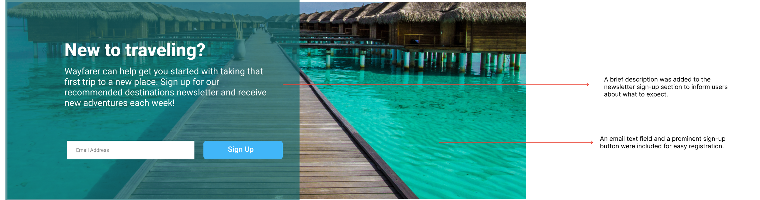
Newsletter Sign Up
A sign-up form for the newsletter was needed in the final section. This would enable users to provide their email addresses and stay updated with the latest news and updates from Wayfarer. Some key improvements made in this section were:
The banner did not align with the visual language of the site.
The sign-up process was overly complex, requiring too many steps and pieces of information.
The banner functioned as a pop-up, which created the impression of an advertisement and might be perceived as intrusive.
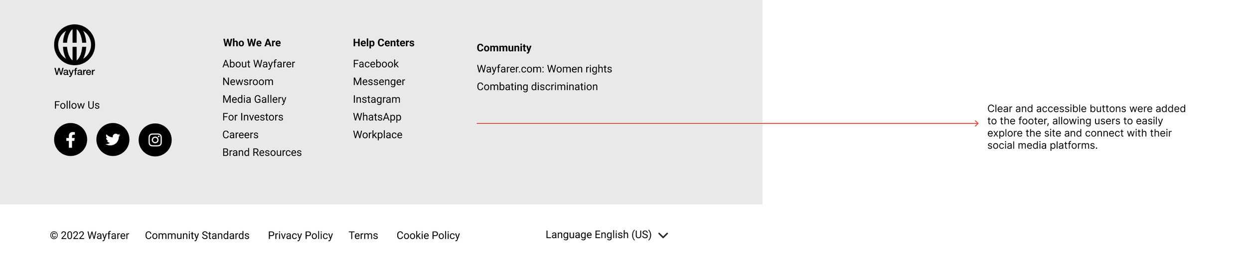
Footer
The footer is divided into three sections for easy navigation. The 'Who We Are' section provides links to learn more about Wayfarer, including the newsroom, brand resources, and the company's story. The 'Help Center' section contains all of Wayfarer's social media links, making it simple to follow us on various platforms. The 'Community' section highlights Wayfarer's involvement in key initiatives such as women's rights and combating discrimination.
Reflection
The Wayfarer website design project was a valuable opportunity I encountered through my design course. It provided numerous learning experiences and insights into areas where I would approach things differently in the future.
Maintaining a strong visual hierarchy is crucial for homepage design to capture and sustain user interest at a glance.
Starting with sketching is always beneficial as it allows for exploration and experimentation with ideas, and provides immediate feedback.
Iteration is key. Continuously refining and revising designs helps improve and address problems, ensuring better outcomes with each iteration.
Responsive App Design
For the next phase, we were tasked with developing a responsive app based on the homepage design. I’ve included my initial iteration here and would appreciate additional feedback on the design.
